// WIDSIX WRITTEN WORD //
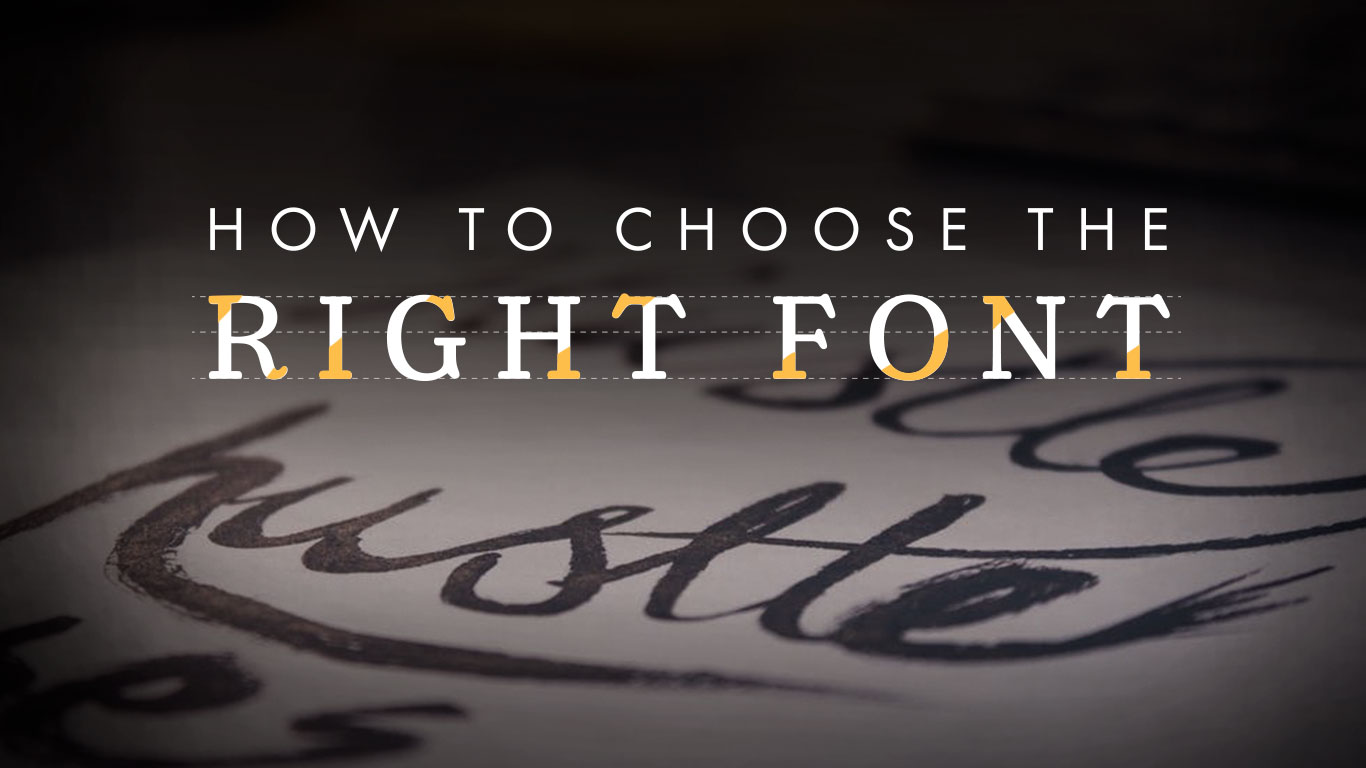
How to Choose the Right Font
Remember when you were a kid, and your favorite font was Comic Sans? You’d slap that shit on anything. It was quirky, it was different, it was fun! It was the best font in the world!
Well not anymore boys and girls, Comic Sans has been CANCELLED!
If you’re still using Comic Sans in 2019, be prepared to have your existence roasted to a crisp by everyone on the Internet. And if you’re a marketing and communications person or designer still using Comic Sans in 2019… well, all we have to say is congratulations because it’s a miracle you’ve made it this far. (I mean, hello, there’s an entire movement to ban Comic Sans forever…)
Alright, so that may have been overly dramatic. Comic Sans has gotten a bad rap over the years, but it was actually found that Comic Sans is highly readable by people with Dyslexia, as the irregular shape of the letters makes it easier to distinguish them from one another. It is even recommended by the British Dyslexia Association and the Dyslexia Association of Ireland. The moral of the story here is don’t judge a font by its typeface. But this revelation also encourages us as communications specialists to be mindful of what fonts we choose to use for various forms of media. What font works for one design element may not work for another for a variety of reasons. So how do you choose the right font? We got you.
1. Keep it clean.
No one likes to squint at their screen for 10 minutes trying to decipher a single sentence because the font is super whacky. So while that gorgeous script you unearthed from the most exclusive depths of that hipster font database might scream “sophistication” to you, your reader might also be screaming… internally. Save the frilly typefaces for headings and short phrases, and opt for more clean, easily readable fonts such as Arial, Tahoma, Verdana, Helvetica (sans-serif) and Georgia, Palatino, and Times New Roman (serif) for long-form copy.
2. Determine the purpose of the content.
What are you trying to say with your content or design? What’s the tone?: Is it fresh? Flirty? Fun? Serious? Try to choose a font that you think carries out the tone of the entire piece. This, of course, is up to artistic interpretation. When you look at each font, try to pinpoint what kind of feeling it evokes for you. Don’t think too hard about it either, because the only reason you’re even noting it is because you’re the designer. The general public isn’t going to be analyzing their impression, it will be a subconscious reaction. But those subconscious reactions are highly important.
3. Search through font databases.
Font databases are excellent sources for all of the best free and paid fonts. Here are some of the best websites to find free fonts:
Just be aware that not all of these are free for commercial use. If you see one you like, it
will tell you whether or not you can use it for profit. If it’s licensed, you may have to pay in order to use it in your advertising campaigns and design endeavors.
Paid font resources:
And these are just a handful. There are TONS of fonts out there, and hunting for the perfect one can feel like a fun treasure hunt, so get out there and explore your options.
4. Cleverly pair fonts.
It’s extremely common (and a smart design move) to always use two fonts: one for the headlines and one for the body copy. But little did you know, there’s a hard science behind pairing fonts. For example, you want to find two fonts that are just different enough to create a pleasing contrast, but not so different that there’s no cohesiveness to the design. Pixel Surplus hand-selected a list of tools that will help you with this daunting task of pairing fonts:
5. Make sure the font can render in web browsers.
Not all fonts are ensured to render perfectly in a browser, and the last thing you want to do is use a font for your website that doesn’t actually show up properly. However, if you’re using a web-safe font file such as OTF or WOFF, you should be good.
Choosing the perfect font seems more complicated than you originally thought, huh? Don’t worry, there really are no rules to choosing a font. It’s mostly up to you and your team’s creative direction. Just remember: you have to be aware of the rules in order to break them!