Have you ever gone to and Instagram page and loved the work presented? Yeah, me too! Merchandising is a funny thing. I equate it to singing, some are born to sing, and others just shouldn’t even sing in the shower alone. Merchandising is the same. That’s why the world waits for us designers to swoop in and make the world beautiful for all to enjoy.
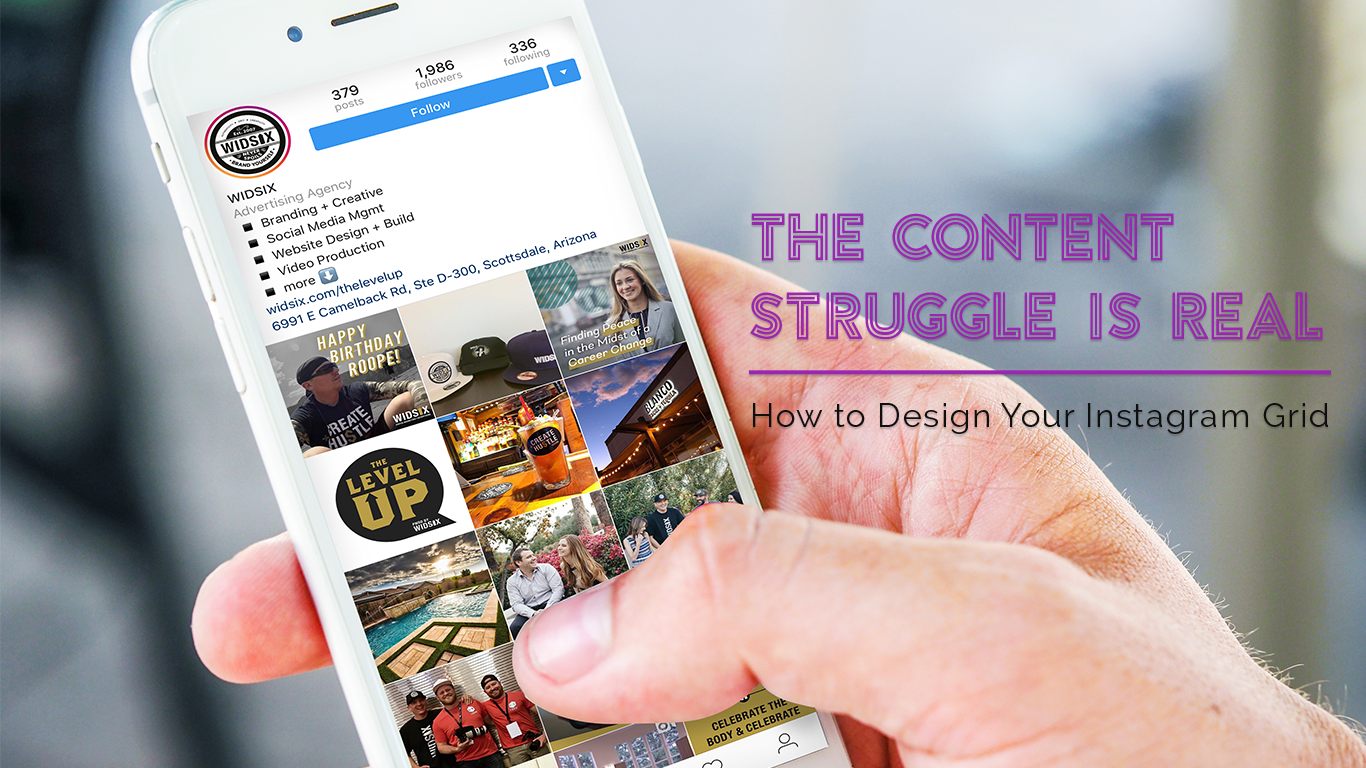
With that said, the same thing applies to social media – Instagram in particular. This is predominantly due to the fact that the content we post is set up into a 9 square grid comprised of only images on each users profile. This format not only makes Instagram stand out from the rest of the social community but it also then requires more allotted time to make sure you are nailing the layouts. With all the intricacies of the details for each post, I wanted to share my process with you on how to design your aesthetic on the platform.
#1 COLOR
Before selecting images, decide the color scheme for the account and most importantly STICK TO IT! It makes image “shopping” way easier and keeps you focused.
#2 SELECT
For all things Holy in this world, there is never any shame in over selecting images. I try to grab 12 – 15 images at least to play around with when creating the next grid. Why do you ask? It’s simple really; I like pretty things like most do, and I find myself selecting images that are alike and similar, right?
With all those images that I have curated together, I make sure I stock up my extra behind the scenes tables on set when designing my grid. More often then not, I find myself switching at least one of my original selected images with an image from my extras table. When this happens the original image doesn’t get benched forever, I just keep it there until the next grid and work it in later. That way no image is left behind and I have one less image to select for the next grid.
#3 ARRANGE
Alright so now it’s time to select your 9 grid images and table 3-6 of them. When selecting, yes, the images are similar. However, I like to break them down into categories pertaining to what you want your accounts to portray.
*For example, I manage an account that focuses on the path of life. I took that literally and visually for said account and kept many of my images demonstrating a pathway of some sort and the categories are:
–Infinity Images
-Subject Distance Images
-Subject Main Focus
#4 DESIGN
Alright now for the fun stuff! Take your images in their categories and spread them out. (Don’t forget to have your last published grid below your designing space so that you can see both grids together) I suggest to never let each category be placed images side by side or up and down. Diagonally go for it! This automatically allows for balance without causing any headaches. Now all you have to do is balance the color out, and you are all set!